Change X-Axis values based on slicer user selection
- Alon Ohayon

- Mar 2
- 4 min read
Almost every dashboard includes some kind of hierarchy between dimensions. For example:
Years and Months
Customers and Campaigns
Category and Sub-Category
In most cases, we want to show trends across those hierarchies.
In one of my dashboards, I had:
A slicer for Years
A line chart with Years and Months on the X-axis
When all years are selected, the chart shows yearly trend. Everything looks fine.

But the problem starts when the user selects only one year:

Instead of showing the months of that specific year, the chart now shows just a single data point – the selected year.
From a business and UI perspective, that doesn’t make much sense.
Yes, the user can drill down to see the months, but:
1. Drill mode must be enabled in advance
2. The user needs to know that this option exists
3. The user must actively right-click and choose “Drill Down”
That’s not intuitive.

Since it’s not so intuitive, I started looking for another options.
I first tried disabling the interaction between the slicer and the line chart. That solved the “single year” issue, but created a new one. Now the user couldn’t drill to months at all.
So that option was off the table.

Next, I created a field parameter with Years and Months.
But the result was still not smooth. The user had to click in multiple places to get the expected behavior.
So I looked for another solution. I searched for “dynamic X-axis selection”, but most solutions relied on manual switching or drill.
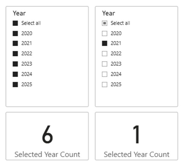
First, I needed to know how many years are selected, so I created this measure:
Selected Year Count = COUNTROWS ( VALUES (DimDate[Year]) ) |
Next, I created a disconnected DAX table that contains both years and months.
*Note: I added a SortKey column for proper sorting. If your hierarchy is not time-based, you can ignore it.
X-Axis = VAR _Months = SELECTCOLUMNS ( DISTINCT ( SELECTCOLUMNS ( DimDate, "Axis", DimDate[MonthNameShort], "SortKey", DimDate[Month] ) ), "Axis", [Axis], "Type", "Month", "SortKey", [SortKey] ) VAR _Years = SELECTCOLUMNS ( DISTINCT ( SELECTCOLUMNS ( DimDate, "Axis", DimDate[Year_Text], "SortKey", DimDate[year] ) ), "Axis", [Axis], "Type", "Year", "SortKey", [SortKey] ) RETURN UNION ( Months, Years ) |
After creating the table, make sure:
Sort X-Axis[Axis] by X-Axis[SortKey]
This is how the table looks like:

Now comes the core logic. I created dynamic measure.
If one year is selected → calculate Sales by Month.Otherwise → calculate Sales by Year.
Dynamic Measure = VAR _IsSingle = [Selected Year Count] = 1 VAR _Calc = IF ( _IsSingle, CALCULATE ( [Sales], TREATAS ( VALUES ( 'X-Axis'[Axis] ), DimDate[MonthNameShort] ) ), CALCULATE ( [Sales], TREATAS ( VALUES ( 'X-Axis'[Axis] ), DimDate[Year_Text] ) ) ) RETURN _Calc |
After that point, the only thing left to do, is to add my X-axis[Axis] column to the visual X-axis, and the new dynamic measure to the Y-Axis.
I added one more measure to visual level filter in that line chart (and set it to 1):
Show Axis = VAR _IsSingle = [Selected Year Count] = 1 RETURN IF ( (_IsSingle && SELECTEDVALUE('X-Axis'[Type]) = "Month") || (NOT _IsSingle && SELECTEDVALUE('X-Axis'[Type]) = "Year"), 1, 0 ) |

The end result was great.
If the user selects multiple years → the chart shows yearly granularity,
If the user selects a single year → the chart automatically switches to monthly granularity.
No drill mode, No Extra clicks.

This approach works not only for Year/Month. You can use the same pattern for:
Customer → Campaign
Category → Sub-Category
Region → City
Anywhere you want the visual to adapt automatically to user selection.
Enjoy :-)


